CSS Float
The most commonly used and well supported layout pattern is the CSS float property. It does have a distinct characteristic associated with it that makes it difficult to understand at first. In the next article CSS Clearfix we will explore this problem specifically with it's fix to keep in mind. For now, we will have lots of fun putting things beside each other.
CSS Float's origin comes from a time when browsers first began supporting images in the content. Let's look at this newspaper article to get a sense of what float was originally designed for. In the first paragraph of the article the text wraps around the image. The image is floated right to that paragraph.
Let's take a look at how something like this is done in HTML.
- There's a container div that centers both the paragraph and image at 500px wide.
- The image (img) is targed by the css and a float: right style is assigned to it.
Float Left, Float Right
Floating an image left and right of the paragraph of content.

Float Beside Each Other
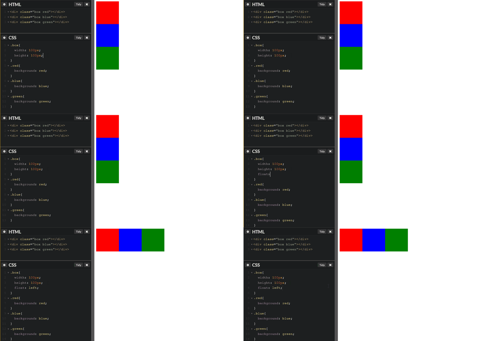
In this example, we have three divs with the class "box", we set a width and height on all the elements with "box" of 100px. Using an alternative class for color we've colored each of these boxes differently. Because all three divs share the "box" class they all float left to eachother.

Clear
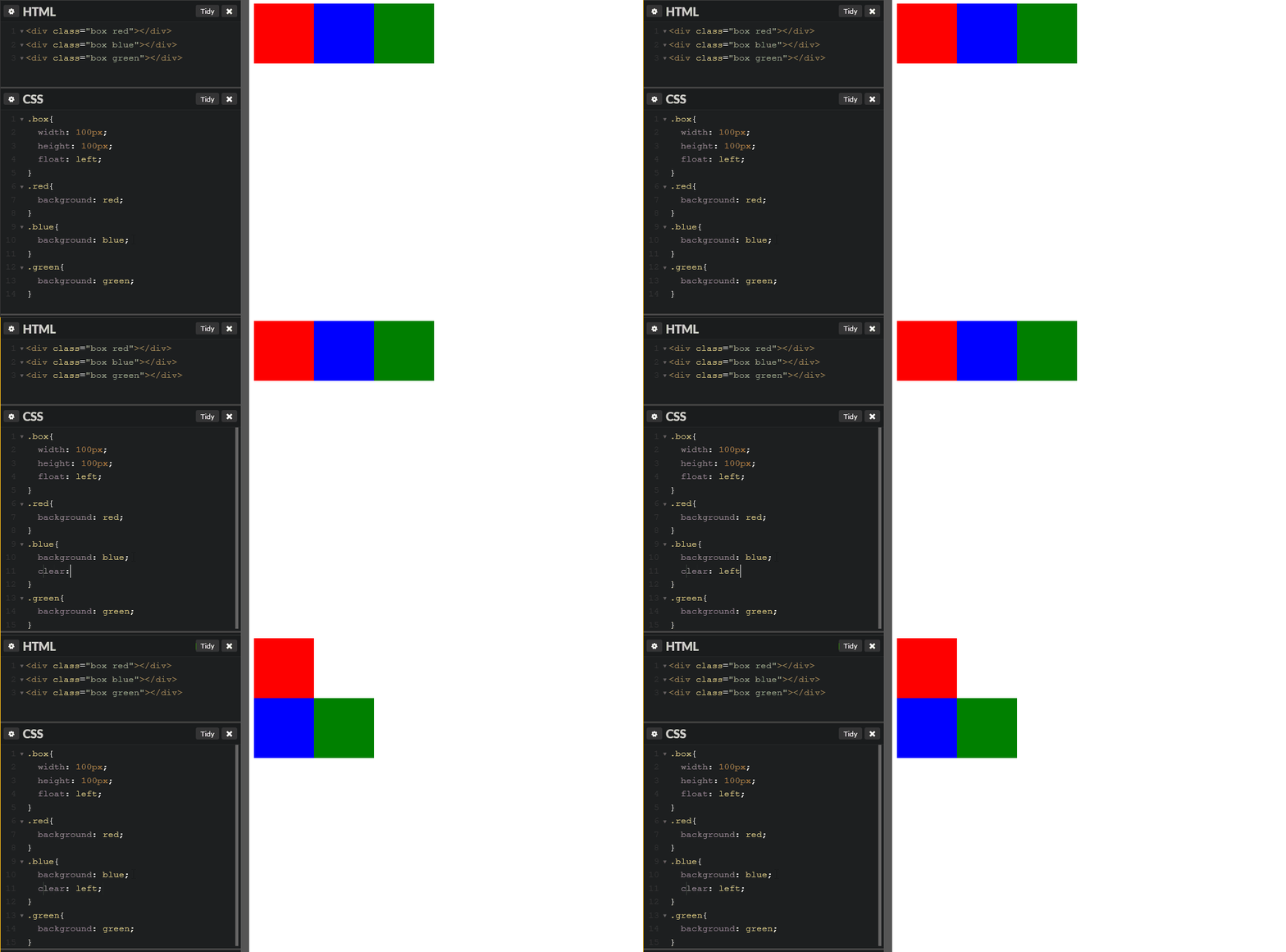
Elements that have elements floated next to them can stop that float from happening. Take a look at how we can use the css clear property on the second blue box to stop it from being affected by the float on the red box above it.

Float Basic Layout
As we progress with layout we will learn how to future proof this pattern and learn about alternative CSS3 layout properties. As a very quick reference we can see how a mobile layout can come together quite quickly for larger displays.
*Toggle both CSS and HTML Tabs to simulate the larger screen size (larger than 650px)
Additional Resource
This YouTube video was created by Steve Griffith.