Grid Item Positioning by Line
Grid Lines
When grid tracks are created, line numbers are assigned to tracks that developers can use to position grid-items across rows and columns.
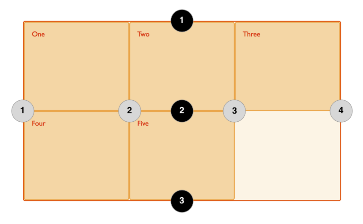
With grid lines in place, we are able to place grid items in the container using the line numbers as the target.
Positioning
To position items we reference a beginning and end line number on both axis using the following properties.
.box1 {
    grid-column-start: 1;
    grid-column-end: 4;
    grid-row-start: 1;
    grid-row-end: 3;
}

/* or the shorthand properties */

.box1 {
    grid-column: 1 / 4;
    grid-row: 1 / 3;
}

/* Or better still use the shorthand grid-area

    grid-row-start: 1;
    grid-column-start: 1;
    grid-row-end: 3;
    grid-column-end: 4;
*/

.box1 {
    grid-area: 1 / 1 / 3 / 4
}
REMEMBER
The properties in the example above reference a line number and not a track. We're used to thinking in terms of rows and columns so if you experience unexpected results, check that values reference a line not a track!
Example
<main class="grid-container">
    <div class="box1 box">One</div>
    <div class="box2 box">Two</div>
    <div class="box3 box">Three</div>
    <div class="box4 box">Four</div>
    <div class="box5 box">Five</div>
</main>
.grid-container {
    background-color: rgb(219, 216, 216);
    border-radius: 5px;
    border: 1px solid grey;
    display: grid;
    grid-template-columns: repeat(3, 1fr);
    grid-auto-rows: 100px;
    padding: 10px;
}

.box {
    background-color: rgb(134, 169, 235);
    border: 2px solid rgb(34, 72, 175);
    border-radius: 5px;
    align-items: center;
}

.box1 {
    grid-column-start: 1;
    grid-column-end: 4;
    grid-row-start: 1;
    grid-row-end: 3;
}

.box2 {
    grid-column-start: 1;
    grid-row-start: 3;
    grid-row-end: 5;
}
One
Two
Three
Four
Five
Further Review
This YouTube video was created by Steve Griffith.