Grid Recap
This is a recap of the CSS Grid module covered in Web Dev I.
CSS Grid is used to create page layouts in two dimensional grids, using both columns and rows at the same time.
Terms and defaults
| Term | Definition |
|---|---|
| grid container | the parent element that we have added the display:grid property to |
| grid items | the direct child elements of the grid container |
| grid lines | the lines separating rows and columns, also referred as row-lines and column-lines respectively |
| grid tracks | the space between the grid lines. Also, known as rows and columns |
| grid rows | the horizontal space between row-lines |
| grid columns | the vertical space between column-lines |
| grid cell | a single unit of the grid, created by the intersection of a row and column |
| grid gap | the thickness of the row and column lines, can de defined individually as grid-column-gap or grid-row-gap |
| explicit grid | The gird rows and columns that we explicitly define using the template properties |
| implicit grid | the rows and columns that are automatically generated by the elements that overflow the explicit grid |
The container
To start working with grid we first need to set the grid container by adding display:grid to the parent element of the elements that we want to layout in a grid.
Note
Unlike flexbox we will not see any change happening to our elements right away. At this point we do have a grid but the grid is an implicit grid, which means each element is creating its own cell. In the example above we have an implicit grid of 4 rows and 1 column.
Grid Template
A grid is comprised of rows and columns hence we have two properties to explicitly define the template of a grid gird-template-rows and grid-template-columns
We define the number of rows by supplying the height of each row to the grid-template-rows property. Example: grid-template-rows: 100px 200px; will create 2 rows with 100px and 200px height respectively.
We define the number of columns by supplying the width of each column to the grid-template-columns property. Example: grid-template-columns: 20% 30% 50%; will create 3 columns with 20%, 30%, and 50% width respectively.
Screenshot of the browser dev tools showing the grid layout with line number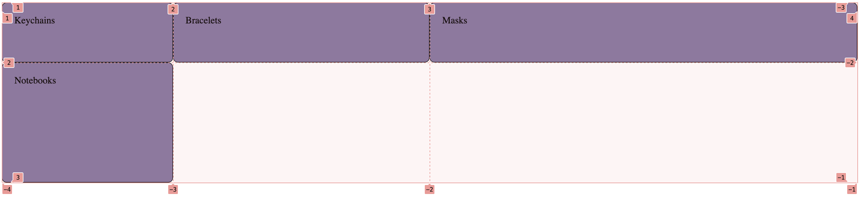
Notes
- We have created an explicit grid of 2 rows and 3 columns, which means we have 6 cells in total
- Grid items will occupy one cell each by default
- Since we have 4 items the last two cells in our grid are empty
- There are 4 grid column lines and 3 grid row lines
Repeat
We can use the repeat() function to create rows or columns with repeating height or width. grid-template-columns: 25% 25% 25% 25%; can be written as grid-template-columns: repeat(4, 25%);
Auto rows and columns
When we have more items than we have cells in our grid or we have one or more items taking over multiple cells we might run out of the explicitly defined cells, in this case the overflowing items will create rows automatically and the height of these rows will not be defined hence it will be set to the height of the content of the items.
To deal with the issue that automatic height can create we can use the grid-auto-columns property to define the width of the automatically generate columns or grid-auto-rows property to define height of the automatically generate rows.
Grid Template Areas
We can name each cell of the grid that we have created using grid-template-areas property. These names can be used to place the grid items in specific areas.
We will need to add a name for each cell in a row, if we want to skip over a cell we can use a period . as the value. Example:
grid-template-areas:
"keys . brace"
"mask note note";
In the above example we are adding the name keys to the first cell, leaving second cell without a name and then using brace for the third cell, the fourth cell is named mask and the last two cells are named the same note.
We will be using these names for our items later.
Screenshot of the browser dev tools showing the grid area names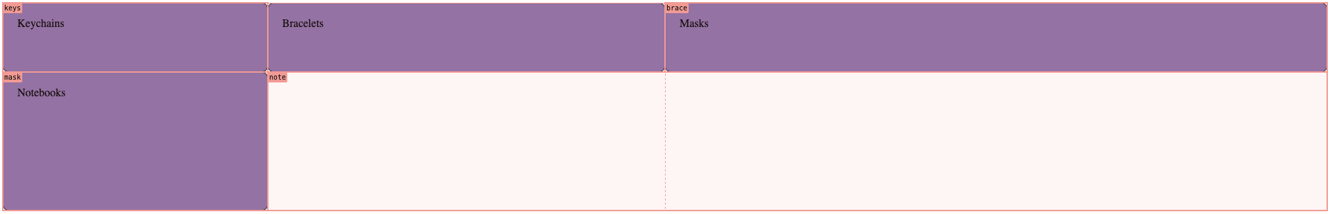
Items Placement
We can place the items in different cells than the default first come first cell behavior, we can also place an item to occupy more than one adjacent cells. The three properties we can use for this are grid-column, grid-row, and grid-area
We can use the line numbers for our grid as values for grid-column and grid-row properties and use the area names for the value of grid-area property.
.product:nth-child(2){
  /* Start at column line 3 */
  grid-column: 3;
}
.product:nth-child(2){
  /* Start at line 2, go to line 6 */
  grid-column: 2 / 6;
}
.product:nth-child(2){
  /* Start at line 2, go to last line */
  grid-column: 2 / -1;
}
.product:nth-child(2){
  /* Start at line 2, span horizontally 3 rows */
  grid-column: 2 / span 3;
}
.product:nth-child(1){
  /* take the grid area with label keys */
  grid-area: keys;
}
.product:nth-child(2){
  /* take the grid area with label brace */
  grid-area: brace;
}
.product:nth-child(3){
  /* take the grid area with label mask */
  grid-area: mask;
}
.product:nth-child(4){
  /* take the grid area with label note */
  grid-area: note;
}
Gap
The gap property can be used to add thickness to the grid lines, we can individually add the value for the column lines using column-gap or row lines using row-gap.
The value accepted by these properties is simply a number followed by a unit. Example: gap: 10px; will add a thickness of 10px to both row and column lines.
Summary of Properties
| Property | Description | Added on |
|---|---|---|
| display:grid; | initializes the grid container | parent element |
| grid-template-rows | defines the height of each row | gird container |
| grid-template-columns | defines the width of each column | gird container |
| grid-auto-rows | defines the height of automatically created rows | gird container |
| grid-auto-columns | defines the width of automatically created columns | gird container |
| grid-template-areas | defines the name of each grid cell | gird container |
| grid-row | defines the placement of grid item based on row lines | gird item |
| grid-column | defines the placement of grid item based on column lines | gird item |
| grid-area | defines the placement of grid item based on area label | gird item |
| gap | defines the thickness of the grid lines | grid container |
| row-gap | defines the thickness of the grid row lines | grid container |
| column-gap | defines the thickness of the grid column lines | grid container |