CSS Media Queries
CSS Media Queries have a variety of uses. They can serve specific styles to different screen sizes, orientation, pixel density and even special printer styles.
Media query is a declaration we write to tell the browser about the aspects of the media we want to select for applying certain styles.
Media Query rule is written starting with the @media rule
@media screen and (min-width: 650px){
  body{
    font-size: 1.25rem;
  }
}
In the code above we are saying that we want to use the @media rule on screen with a minimum width of 650px or above to apply the styles enclosed in the {}.
Note
There are two closing brackets at the end, one for the body tag styles and one for media rules
Device Widths
We use the following four properties in the media-queries to determine the device width or range for which we want the styles to be applied.
- min-width
- max-width
@media screen and (min-width: 650px){
  /* Styles applied for minimum width of 650px and over */
}
@media screen and (max-width: 900px){
  /* Styles applied below width of 900px */
}
@media screen and (min-width: 400px) and (max-width: 1000px){
  /* Styles applied between 400px and 1000px */
}
CSS Cascade and Media Queries
As we start exploring media queries and learn more about web development, we're going to to always aim for a mobile up approach. We're going to create our websites with mobile styles first and extend our designs as more space allows them to grow.
Leveraging the cascade of CSS when we style the our web applications with mobile first in mind, this helps send only whats needed to the devices rendering them, and will also make our overall CSS architecture easier to work with.
What we will notice is that the min-width media query will be our primary query. We add our default styles without any media query first and then as the screen size increases we make adjustments to the styles for larger and larger screen sizes.
The styles applied inside a min-width media query are inherited and cascaded to larger screens so we do not have to repeat our styles.
h1{
  font-size: 1.5em;
}
@media screen and (min-width: 600px){
  h1{
    font-size: 2.5em;
  }
}
@media screen and (min-width: 900px){
  h1{
    color: coral;
  }
}
Print Styles
We can use the media query to add specific styles for printing. Mainly this is useful when we want to use the styles for hiding images, or displaying links next to the anchor tags.
For writing the print styles we use the following media query
@media print{
  /* Styles for the print of the page */
}
Hiding images from print
@media print{
  img{
    display: none;
  }
}
Showing links next to anchors
@media print{
  a::after{
    content: " <" attr(href) ">";
  }
}
Larger text for larger displays
Flexible designs at different breakpoints
We're not limited to text, we can apply any styles at any breakpoint, like this square, where we change its shape, colour, and size.
Serving Images
We can also use media queries to serve different background images at different sizes.
For the users who are using any device less then 650px they will see a tiny mouse thats only 8.42 KB in size. This tiny mouse turns into a gigantic group of elephants for any device that renders larger then 650px. This image is much larger then the images served to what we are assuming are cell phones. We cannot serve images by bandwidth yet, our best measurements are combinations of widths that change with the landscape of devices out there.
As we progress with our layouts we will explore setting widths and floating sidebars against our content. We will build navigation for smaller devices and expand them out for larger screens.
Media Queries & Layout
NOTE:
Floats and clearing floats to create page layouts has been largely replaced by flexbox and CSS grids. The content here is still relevant as they are still widely used and you should be aware of them. We will be focusing in flexbox and CSS Grids for page layouts in this course.
Most semantic HTML elements we use for layout are block level elements. This means by default the contents inside will align vertically one after another like we've seen with other text based elements. HTML adapts to any screen size and we can use this to our advantage to style our layouts for all screen sizes.
One of the best ways to get started building any web application is to iron out the layout components before worrying about what's inside. We can look for common patterns to group in larger boxes. Everything on the web fits into this model.
To simply decouple our layout from other elements its much easier and more efficient to keep these layout elements separate than grouping them together by a class when it might seem redundant to add another div. Adding another div for the layout specific style ensures a more module component.
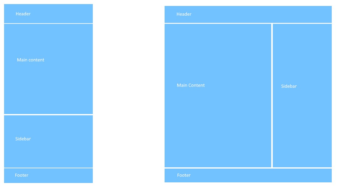
Let's look at a common layout pattern. Header, content, right sidebar, footer. We can imagine the layout structure will look similar to the image below. The wire frame on the left represents the layout structure smaller screens sizes will render. On the right, when there is enough minimum width to support the content side by side, Float the Main Content and Sidebar Left to each other.
HTML Structure
We can begin with the HTML Markup, a header, section, aside, and footer. One addition is a container div that we can apply CSS Clearfix to once we float the Main Content and Sidebar elements.
The Outline Property
Let's roughly colour in our layout elements and assign some heights to visualize what each of them are doing.
Floating at a min width breakpoint
At 400px wide, float the main content and sidebar beside eachother, float the sidebar right with a little bit less width for spacing in between.
Centering the layout
Setting up a common container class for centering components of the site to the maximum width we set. In this first pen, we want the header and footer always extend to the size of the screen. The main-content and sidebar are centered at a maximum of 400px wide.
Using a Container Class
The container class itself is modular and can be assigned to the header and footer centering both of them at 400px wide as well.
Adding Content to the Layout Structure
Now that the layout styles and layout are in place, it's easy to add whatever content inside. In the example below we've made some familiar additions below. We've set the CSS Box-Sizing of all elements to border-box. This makes it easier to add padding to the .main-content section without recalculating the widths. There's a CSS Background Image of toast on the body and the <img> tag inside the .sidebar has a max-width of 100% meaning it will scale from 1-100% up to it's real size, it will not distort it scaling it more than the size it is but will resize to anything smaller than it's natural size.
This YouTube video was created by Steve Griffith.