Responsive Web Design Patterns
With the introduction of the true mobile browser, no longer were web sites being accessed exclusively by desktops and laptops. In 2010, Ethan Marcotte, provided the industry with a wake-up and a path with his now famous article, Responsive Web Design. Over a decade later, the world and industry has moved forward, and the idea of responsive web design is no longer an idea, it is a requirement.
In 2012, two years after Marcotte told the world about Responsive Web Design, Luke Wroblewski, seeing patterns in how developers were designing their responsive layouts, wrote the article Multi-Device Layout Patterns. Wroblewski broke these layout patterns into 5 categories: tiny tweaks, mostly fluid, column drop, layout shifter, off canvas.
Tiny Tweaks
Tiny tweaks is the simplest of all the responsive layout patterns and relies heavily on the natural responsiveness of the HTML. These layouts consist of a single column that fluidly grow and shrink with the screen size. This layout structure requires few if any media queries and little effort to optimize it across all screen sizes.
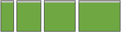
Illustration created by Luke Wroblewski.
This type of the layout can be easily accomplished using CSS Grid and explicitly setting the row heights for the header and footer.
<body>
  <header></header>
  <main></main>
  <footer></footer>
</body>
body {
  display: grid;
  grid-template-rows: 75px 1fr 100px;
  width: 100%;
}
Mostly Fluid
The mostly fluid layouts rely on the concept of a fluid grid system, that will shift depending on the screen size. On smaller screens, the mostly fluid layout will be a single column with a fixed max-width for larger screens.
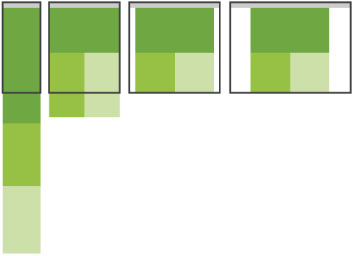
Illustration created by Luke Wroblewski.
Thanks again to CSS Grid, creating a mostly fluid layout is relatively painless. In the example below, nested grids and a fixed max-width of 1200px were used. A single media query was used to shift the <main> from a one column to a two column grid.
<body>
  <header></header>
  <main>
    <section></section>
    <section></section>
    <section></section>
    <section></section>
  </main>
  <footer></footer>
</body>
body {
  display: grid;
  grid-template-rows: 75px 1fr 100px;

  max-width: 1200px;
  margin: 0 auto;
}

main {
  display: grid;
  height: 100%; /* height is used to simulate content */
}

@media (min-width: 560px) {
  main {
    grid-template-columns: repeat(2, 1fr);
  }
}
Column Drop
The column drop layout is when a layout will have multi-columns on a larger screen, but begins dropping columns as the screen size gets smaller. This means content will be less fluid and instead adapting to the screen sizes will be made responsive by stacking the columns.
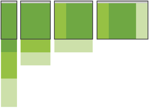
Illustration created by Luke Wroblewski.
With flexbox and flex-wrap, creating the column drop layout is quite simple. Only a minimum amount of media queries are required to adjust the order and make sure the element fill the appropriate amount of space.
Note: The layout was designed large screen first, and used media queries to move down. While, it is possible to create this layout first, the concept of column drop implies that design starts with the largest screen.
<body>
  <header></header>
  <main></main>
  <footer></footer>
</body>
body {
  display: flex;
  flex-wrap: wrap;
}

header,
main,
footer {
  flex-grow: 1;
}

header,
footer {
  min-width: 150px;
}

main {
  min-width: 400px;
}

@media (max-width: 699px) {
  header,
  main {
    height: calc(100% - 200px);
  }

  footer {
    height: 200px;
  }
}

@media (max-width: 549px) {
  header,
  footer {
    width: 100%;
  }

  main {
    order: -1;
  }
}
Layout Shifter
The layout shifter pattern is likely the most complex and therefore requires the most adapting. With this layout, various screens can see vastly different layouts. While the layout shifter does require the most amount of work, it also has the most room for innovation and creativity. There are many different possibilities for creating a responsive web design using this technique, the following illustration and the example is just one of those possibilities.
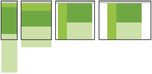
Illustration created by Luke Wroblewski.
While in the past the layout shifter required a significant amount of work to create, which likely kept it less popular than some of the other designs on the this list, thanks to CSS Grid and grid areas it can be remarkably simple. In the example below, a single grid is used, which explicitly set the columns and rows for the grid. Then grid-template-areas is used to visually create mobile layout. Each element is assigned an area and the layout is set. From there, each time layout needs to change only the grid-template-areas needs to be adjusted.
<body>
  <nav></nav>
  <header></header>
  <main></main>
  <footer></footer>
</body>
body {
  display: grid;
  grid-template-columns: repeat(5, 1fr);
  grid-template-rows: 75px 1fr 1fr 100px;
  grid-template-areas:
    "nav nav nav nav nav"
    "header header header header header"
    "main main main main main"
    "footer footer footer footer footer";
}

nav {
  grid-area: nav;
}

header {
  grid-area: header;
}

main {
  grid-area: main;
}

footer {
  grid-area: footer;
}

@media (min-width: 700px) {
  body {
    grid-template-rows: 1fr 1fr 1fr 100px;
    grid-template-columns: 200px repeat(4, 1fr);
    grid-template-areas:
      "nav header header header header"
      "nav main main main main"
      "nav main main main main"
      "nav footer footer footer footer";
  }
}
Off Canvas
The final responsive layout category is off canvas. The principle with this pattern is that instead of stretching or rearranging content to fit on the screen, just push it off the screen until it is needed, and retrieve it using JavaScript. Most screen content is limited to navigation and tools, but there is a lot of flexibility to what can be set off canvas.
It can be argued that this last category is not responsive design at all, as it is just hiding content rather than finding a way to make it fit. Futhermore, such a design is less convenient for the user, and they are forced to reveal the content before they can consume it, and if content can be hidden is it necessary in the first place?
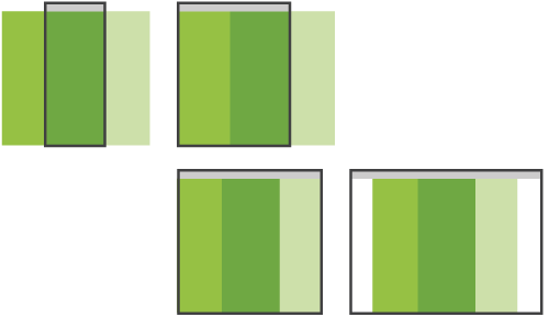
Illustration created by Luke Wroblewski.