CSS Screen Size and Typographical Rhythm
Strong typography can have a big impact on the perceivable quality of a website.
Let's look at some examples of strong typography:
- Best examples of typgraphy - awwwards
- A journey through beautiful typography - Smashing Magazine
- Responsive Typography The Basics - ia.net
In CSS, we have a variety of font based styles we can apply to our CSS. The line-height, font-size and margins are the most commonly associated styles with vertical rythym.
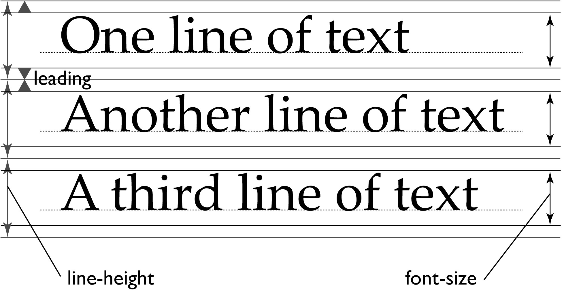
Image from www.w3.org
The most commonly used font-families: https://www.cssfontstack.com/
To quote Improving Layout with Vertical Rythm:
If you have a font-size of 16px and a line-height of 1 then your line-height will also be 16px. However, line-heights are usually best sitting between 1.4-1.6 times the size of your font (visually, this just seems to work with most fonts - though don’t take that as a rule, just play around with it). If we then look at having a line-height right in the middle of that, of 1.5, our line-height will be 24px - and that is our baseline number. From here on out, we want to make sure that all the content and typographical elements on our design match or add up to this 24px figure.
Typecast dives a little deeper into the math of the alignment of ideal text.
Typographic Scales and Vertical Rhythm - VIDEO
CSS Typography Properties
font-family
The choice of font used for the element(s).
font-size
The size of the font
line-height
The space between the lines of text
font-weight
The Boldness of fonts 
text-transform
Uppercase, lowercase 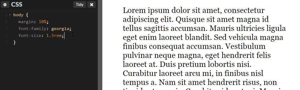
Example: Dissecting A List Apart
By default, the HTML elements will have their own styles.
By examining the styles of the H1, H2, and P elements we've copied the styles into our default example and explore the spacing and font styles for these elements. It's a big improvement.