Responsive Grid Of Images
Description
Create a responsive grid of images to serve different sized images to different devices. Use the <picture> element to serve appropriate image sizes for your grid.
Requirements
Using the <figure> and <picture> element - create a responsive grid of images that substitute in appropriate images at each breakpoint. Use images from Placehold.it . Using a mobile first approach, create a grid that expands from one column into two columns and finally centered with three columns. Spacing of images should be consistent and balanced.
Be sure to attribute images with <figcaption>
For this assignment, use Flexbox and/or CSS Grid. Please refrain from ‘floating’ in this assignment. 😉
Restrictions
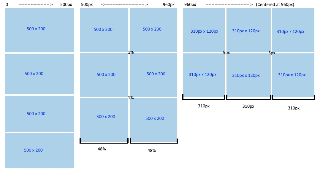
Breakpoint Columns
0 -> 500px
Single Column, Serve a 500 x 200 image that scales the full width of the screen.
500px <-> 960px
Two Columns. Keep the 500 x 200 image but float the columns to fit two columns with 1% margin around the column items.
960px ->
3 Column, Centered at 960px. Serve 310 x 120 image, this will be the only extra picture source needed. The margin between the columns should now be 5px.
Rubric
| Criteria | Pts |
|---|---|
| Mobile first approach | 1 |
| Breakpoints set as required | 2 |
| Columns and contents display as described | 3 |
<picture> element implemented as required including the appropriately sized sources, <img> tag and alt attribute | 3 |
| HTML and CSS are error free and pass validation | 2 |
| Content centered in viewport | 1 |
<figure> and <figcaption> implemented correctly | 2 |
| Spacing of pictures is balanced and consistent with available space | 1 |
| Instructor Discretion | 5 |
| Total | 21 |
Submission
Submit a zip of your folder. Use the following naming convention for the zip. Be sure to use hyphens for the spaces and all lowercase lettering.
username-mtm6130-responsive-image-grid.zip