Final Project
Objective
- Demonstrate the successful implementation of HTML elements learned to date
- Demonstrate understanding of HTML structure and semantics
- Demonstrate the successful implementation of CSS styling knowledge learned to date
- Demonstrate your knowledge of a mobile first approach to HTML and CSS development, responsive layouts, images and styling
Description
3 Page Responsive Website
Choose your Theme:
Baking Website
Your friend has just opened a new business baking an assortment of goodies. They've asked if you can help make them a website to show the customer where they are located, some of the goodies for sale and a nice way to contact them.
Gaming Website
A site dedicated to all things gaming. It's got reviews, news, live feeds and community images all driving a very visual gaming experience. Once a month there is a tournament you can sign up for and a map to the location in the contact page.
Sports Website
You're in charge of setting up and maintaining a website that helps local teams play their favourite sport. The site has highlights, scores, standings, a way to sign up and an interactive map showing the field location.
Common Elements
Navigation Items
- Home
- About
- Contact
Footer
- Navigation Repeated in Footer
- Back to Top Link
- Copyright
HTML Pages
index.html
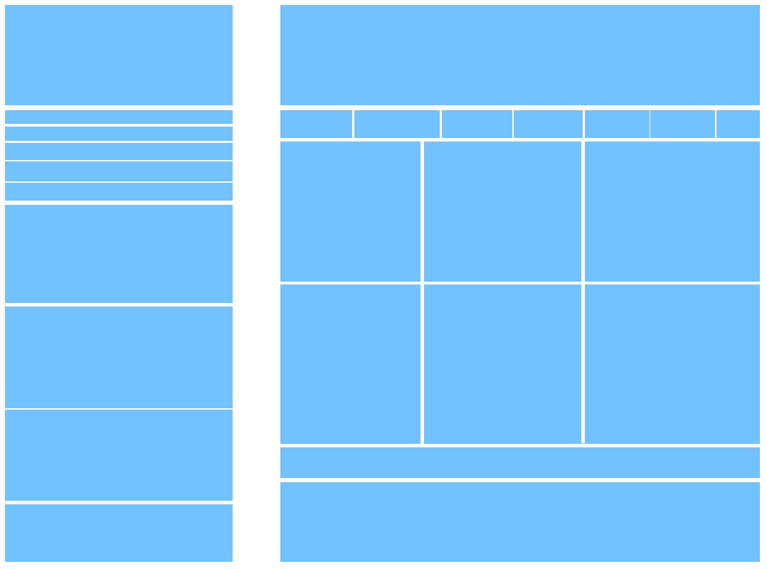
- Main Banner
- At least 6 product columns of related imagery and product callouts
about.html
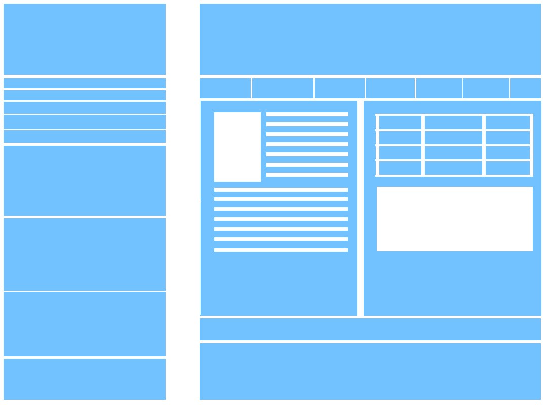
- 2 Column Equal Spaced Layout
- HTML Table of Weekly Hours Opened.
- Filler Content and Imagery linked to your theme
contact.html
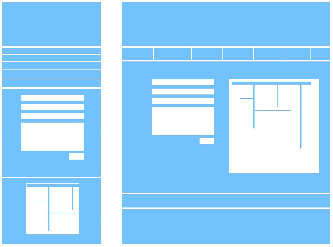
- HTML Contact Form
- Google Maps Embed of Map of Location
Requirements
Breakpoints
- Must be a single column to start, the layout must be optimized and begin with mobile styles
- Require at least one breakpoints (768px) for your largest layout styles
Imagery
- Responsive images must be considered, background imagery or picture element.
- Font icons or SVG for icons if applicable.
Validate
Naming and File Structure
- Files Properly Organized
- Smart class names and common pattern groupings
- Use of comments and hierarchical organization
- Limited redundancies across pages. Shared components.
- Symantec Markup appropriate for content on page.
- Head title defined across pages.
Common Components
Look for patterns of elements you can reuse for other sections of your site. a .col-2 class is more general than two .about-col-2, .contact-col-2 that have the same styles. Look for other components that can share baseline styles. The navigation in both the header and footer can share common styles and extend on to those with their own unique styles.
Best Practices
HTML Best Practices
- Before starting to write your page's HTML plan for the tags you will be using, the blocks you will be breaking down the layout into.
- Use proper HTML document structure and define the doctype
- Place your stylesheet in the head tag
- Use alt attribute with your images
- Use meaningful tags
- Use lowercase markup,
<div></div>vs<DIV></DIV> - Always close your tags
- Smart class names(representing the elements contents) and common pattern groupings(using same class names for similarly styled elements)
- Validate your HTML often
CSS Best Practices
- Use CSS reset
- Start with styling your web page to work for mobile layout, mobile-first
- Don't Repeat Yourself (DRY)
- Do not target the same element multiple times to add different styles use the same target
- Use min-width media queries only
- Validate your CSS often
Outline Examples
Outlines of layout breakpoints. It is not necessary to follow these outlines below, you are free to explore your own designs as long as the key elements are there.
index.html outline example
about.html outline example
contact.html outline example
Submission
Submit a zip of your folder. Use the following naming convention for the zip. Be sure to use hyphens for the spaces and all lowercase lettering.
username-mtm6130-final.zip
Example
aaaa8888-mtm6130-final.zip