Mid-term Project
Objective
For this assignment you will be demonstrating your ability to apply the material learned up to this point in the course. These include (but not limited to.. ):
- Responsive layouts, navigation and typography
- HTML page structure and layout
- Typography
- HTML images
- CSS styling
Description
Your task is to re-create the responsive web-page in the images provided from scratch using the layout techniques and HTML elements you've learned up to this point. Web-page needs to be developed based on the screenshots provided for smart-phone, tablet and desktop view. Use grouping patterns to organize your content in semantic and re-usable components. Provide lots of comments in well-organized files.
Once the HTML structure is completed, start styling the mobile-view. Only after the mobile-view is entirely completed, start styling the tablet-view. Only after the mobile and tablet views are entirely completed, start styling the desktop-view.
Max-width of the content is 80rem (desktop view). At this width, entire webpage is centered in the middle of view-port.
Requirements
Global Requirements
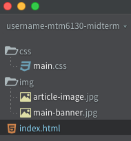
Folder Structure & File Naming
CSS Reset
The basic reason for using CSS reset is a development of cross-browser compliant websites. All browsers have presentation (CSS) defaults, but no browsers have the same defaults.
- You will need to remove a default web-browser's style using CSS reset at the top of your style-sheet using CSS Reset
Font Stack
- Arial, Helvetica Neue, Helvetica, sans-serif
Mobile Breakpoint Requirements
- Up to 35rem
- Font-size: 0.75rem
- Line-height for body-text needs to be set as a ratio between 1.4 and 1.6
- Entire content has to be moved for 1rem from the edges of web-browser window.
Because we used CSS Reset, you will need to style <h1>, <h2>, and <p>.
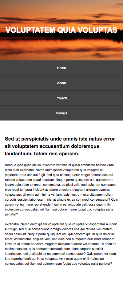
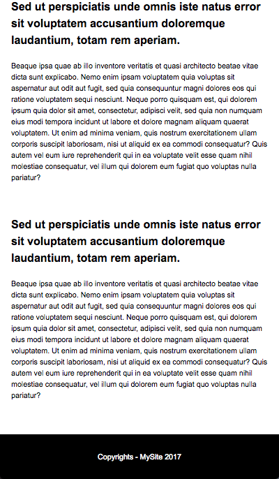
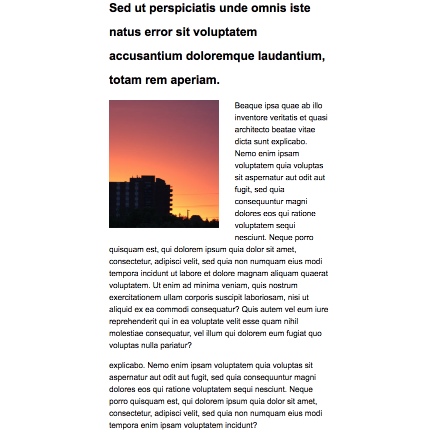
Mobile View Reference
Tablet Breakpoint Requirements
- Between 35rem and 80rem
- Content font-size: 1rem
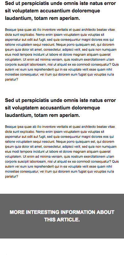
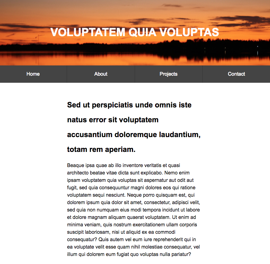
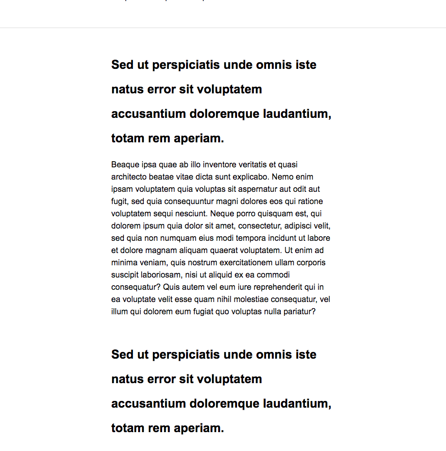
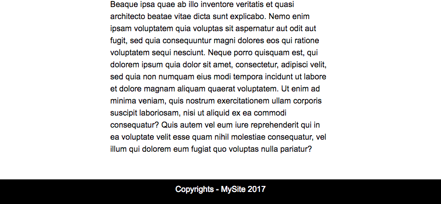
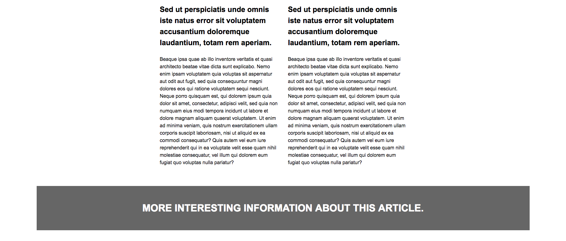
Tablet View Reference
Desktop Breakpoint Requirements
- Greater than 80rem
- Content font-size: 1rem
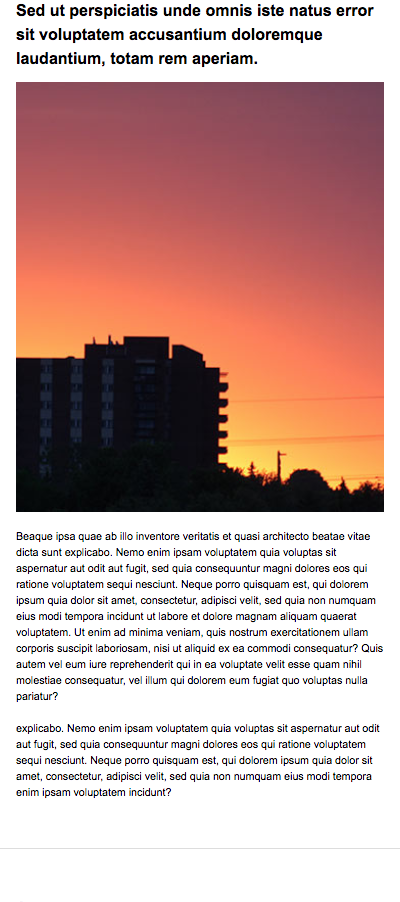
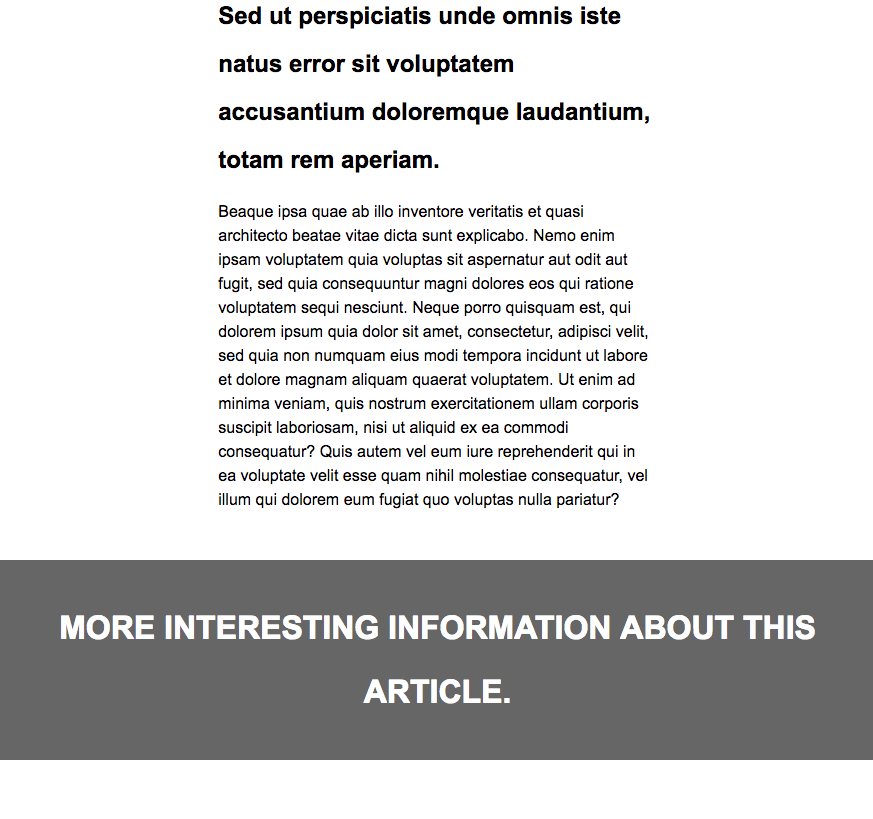
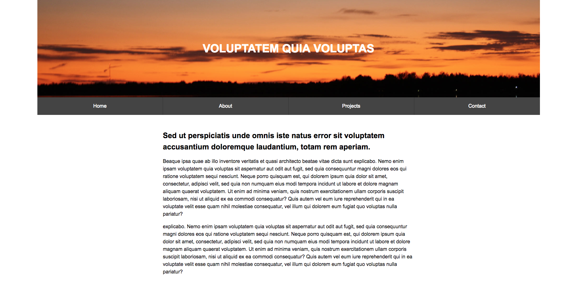
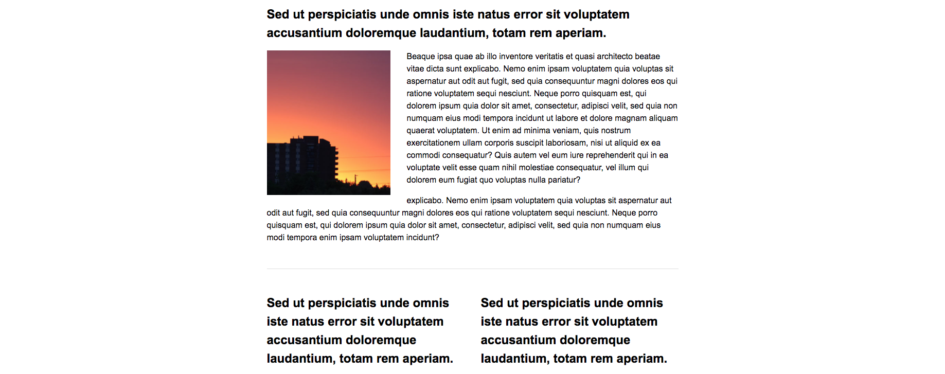
Desktop View Reference

Rubric
| Criteria | Pts |
|---|---|
| Folder structure and file naming adheres to course standard | 3 |
| CSS Reset applied | 3 |
| HTML and CSS include comments | 3 |
| Font stack applied properly | 3 |
| Mobile first approach | 3 |
| Mobile breakpoint is representative of reference | 6 |
| Tablet breakpoint is representative of reference | 6 |
| Desktop breakpoint is representative of reference | 6 |
| Images are positioned and sized correctly | 3 |
| Passes CSS Validation | 6 |
| Passes HTML Validation | 6 |
| Instructor Discretion | 6 |
| TBD... | 3 |
| TBD... | 3 |
| Total | 60 |
Submission
Submit a 'zip' of your project folder. Use the naming convention below for your submission and be sure to use hyphens for the spaces and all lowercase lettering.
Example
username-mtm6130-responsive-nav.zip