Picture This! Participation
Objective
Use what you have learned about the <picture> tag, srcset and sizes attributes, and responsive images to complete the blog post header.
Requirements
The following requirements must be met in order to complete the assignment successfully:
- Download the Picture This! starter files. Inside the zip folder is an
index.htmlfile, astyle.cssfolder, and aimagesfolder containing one image. - Using the image tables below, determine which image sizes will be necessary. There will be two image ratios: landscape and square.
- Use a photo editing program, like Photoshop, or resizing service, like derivv, to create multiple sized images of the provided image.
- Add the appropriate HTML / CSS, so that if the viewport is smaller than 960px, the image will be displayed in landscape and at an adequate resolution.
- Add the appropriate HTML / CSS, so that if the viewport is 960px or larger, the image displayed is a square and at an adequate resolution.
Image Table
Landscape Image
| viewport | 1x | 2x | 3x |
|---|---|---|---|
| 320px | 320px | 640px | 960px |
| 480px | 480px | 960px | 1440px |
| 720px | 720px | 1440px | 2160px |
| 960px | 960px | 1920px | 2880px |
Square Image
| viewport | 1x | 2x | 3x |
|---|---|---|---|
| 960px | 480px | 960px | 1440px |
| 1280px | 640px | 1280px | 1920px |
| 1600px | 800px | 1600px | 2400px |
Square image is view at half the viewport
Examples
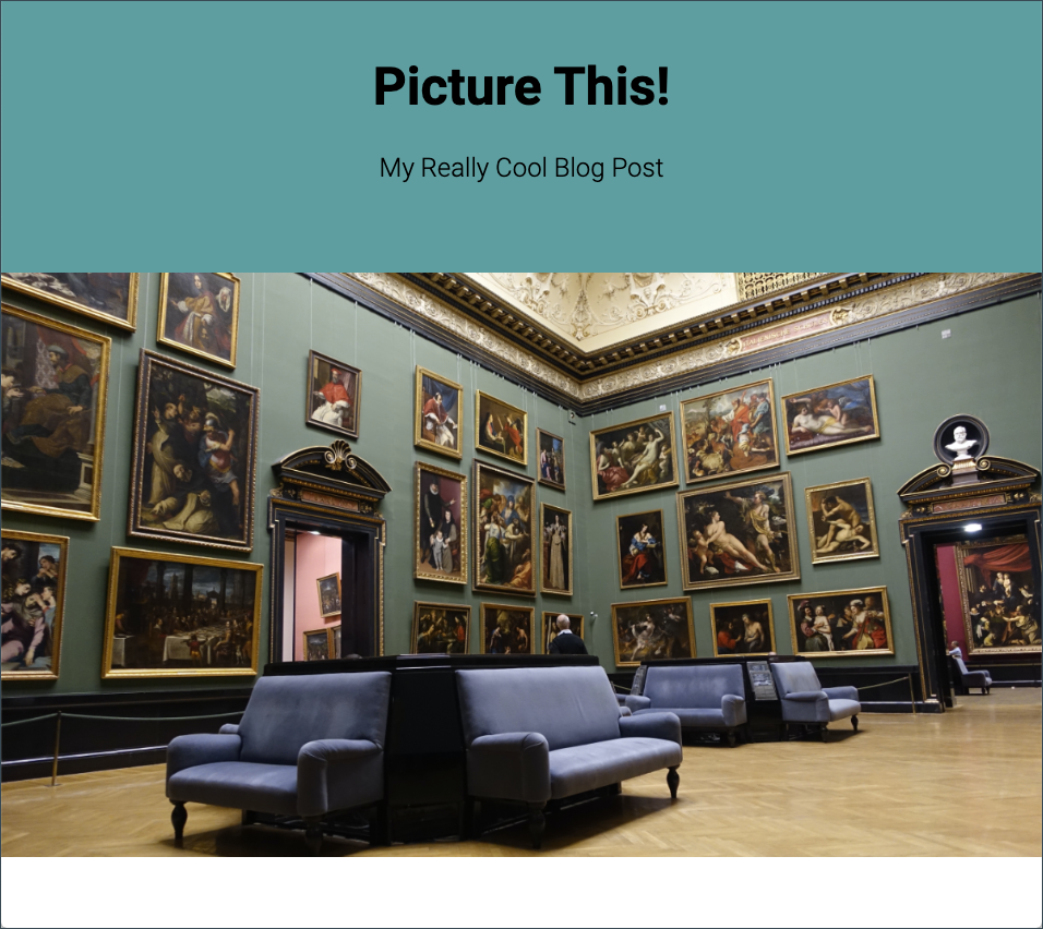 Less than 960px
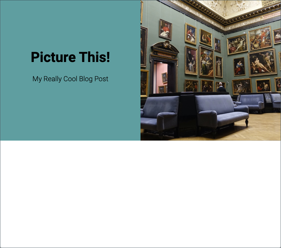 960px or more
Submission
This project and all of it assets should be published to your GitHub paging site. The URL to the live version of the project should be submit to the Picture This assignment on BrightSpace.